
Mediocre communicators are all the same! By that, of course, I mean that mediocre presenters get in the rut of presenting everything the same way.
In my SpeechDeck Communication System, there are 5 types of illustrations — five types of proof that support the message you are trying to convey. I call them the 5 Es. Mediocre presenters tend to pick one or two and ignore the rest.
Explanation
Mediocre speakers almost always default to the least effective E — explanation.
This is the speaker who rambles. This is the presenter who thinks he has to explain the joke when nobody laughs. This is the “teacher” who thinks “teacher” is a synonym for “lecturer.”
This is the presenter whose first slide is a bulleted list, whose last slide is a bulleted list, and all the slides in between were probably bulleted lists, but nobody was paying enough attention to remember.
This is the lecturer who follows the same format from beginning to end and that format is … explanation.
Did you notice that instead of explaining what it means to explain something, I instead gave you examples of people who explain? I could have just explained it:
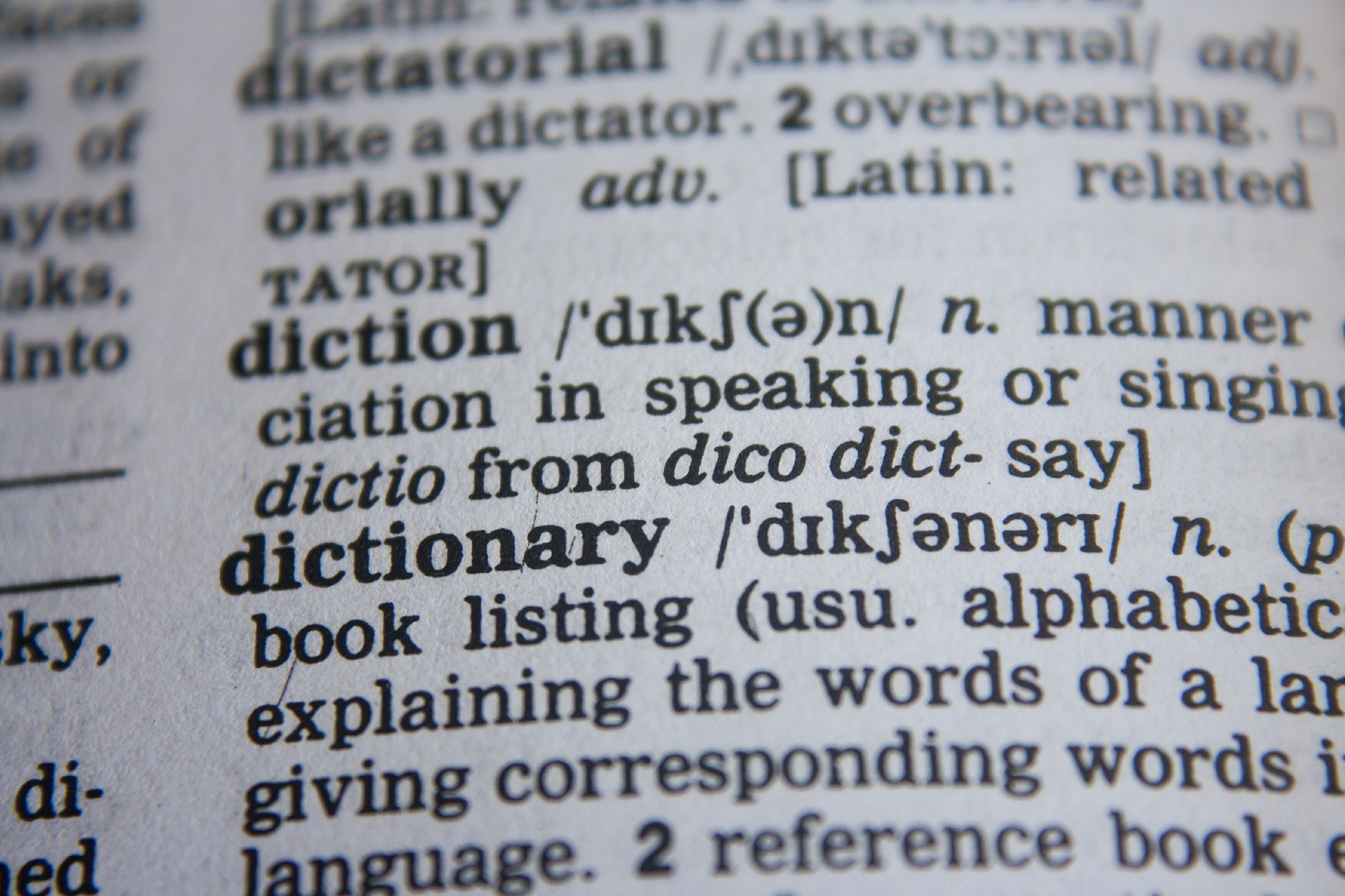
Explanation: statement or account that makes something clear
 That definition is REALLY boring. <<<—- And that sentence (and this one) are the perfect examples of explanation. You really don’t need me to tell you any of this paragraph. As you see, explanation is usually unnecessary. We better try something else …
Are you an explanation addict?
You know that you’re falling into the explanation trap if you catch yourself trying to make a point, and then clarifying it, and then rewording it again and again. If you’re never satisfied with what you say, that’s a sure sign that you’re trying to explain something instead of “present” something.
Explanations usually focus on a mediocre speaker’s selfish need to perfect and articulate information in his or her own head rather than the inspirational speaker’s desire to “present” something the audience truly wants and craves from the audience perspective.
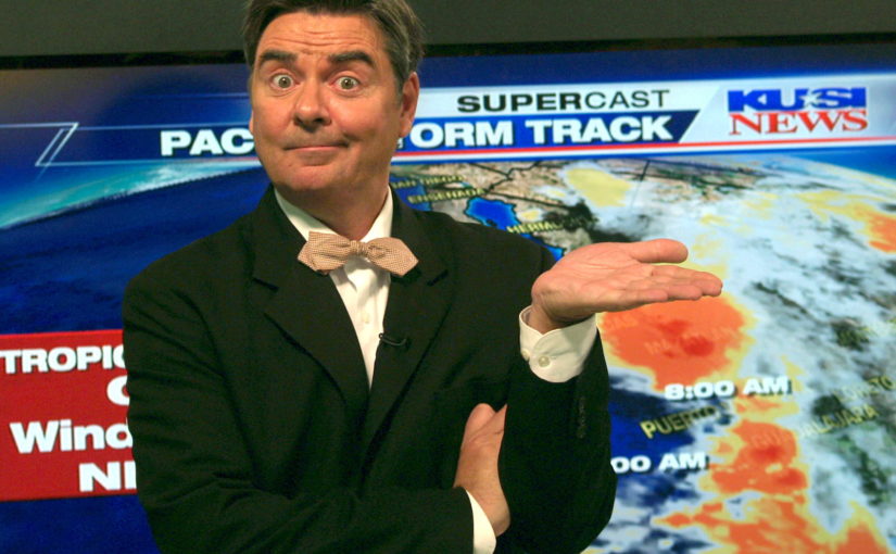
Here is a mediocre TV weatherman who is an explanation addict:
Tomorrow will be a nice day … nice, meaning a day you probably will like … maybe not perfect, but nice, you know … not to cold, not too hot, nice … you might prefer to call it a pleasant day … or comfortable … the dictionary defines NICE as agreeable, satisfactory …
Of course, if you’re mediocre enough to use such an ambiguous word as “nice,” some explanation will be required.
Building a Better Explanation
No speaker can avoid all explanations, but not all explanations are created equal:
- Definitions
- Descriptions
- Comparisons
- Visuals
- Demonstrations
- Analogies
I’ve created the above (incomplete) list of explanations in order of typical effectiveness.
The mediocre presenter inexplicably feels the need to EXPLAIN details that are irrelevant or obvious.
In 2007, apple began selling the iPhone. Before 2007, people didn’t have smart phones, or any phone with a touchscreen or internet which they could access by tapping the screen.
If you were in the audience do you really need the speaker to explain to you that once upon a time you didn’t have a smartphone? NO! DEFINING what a smartphone is and DESCRIBING how to use it is pure unnecessary EXPLANATION.
Giving that explanation makes you look less credible, less interesting, and more patronizing.
It might look obvious in my example, but I’ve heard nearly those exact words about the very subject of cell phones in numerous presentations.
DEFINITIONS and DESCRIPTIONS are usually the least effective explanations. If you must have descriptions, such as describing the setting of a story, make sure you use the SpeechDeck principles of color to make those descriptions more engaging.
Keep logical explanations simple:
Most of us didn’t have smart phones until at least 2007
That’s enough to raise the point that things have changed. We already know what that implies without having it explained to us.
 If you really feel the need to drive home a point about not having smart phones, don’t explain it with a DEFINITION or DESCRIPTION, use one of the more effective types of EXPLANATIONS such as a DEMONSTRATION in which you could imitate using a 1990 style car phone in today’s world, or an ANALOGY:
In 1990 you probably had a VCR. Do you remember the video store charging you extra fee if you didn’t rewind? We didn’t have smartphones until the iPhone in 2007! Imagine using VHS tapes today, or 1990s style car phones today …
I hope you can see, without any commentary, how DEMONSTRATIONS and ANALOGIES almost always make less patronizing EXPLANATIONS than DESCRIPTIONS and DEFINITIONS.
The Weatherman
The simplest way for the amateur to rise above mediocrity is simply by replacing the long-winded definition with a COMPARISON:
Tomorrow will be a nice day … 5 degrees warmer than today.
A weatherman could take it up another notch with demonstration or analogy.
Weatherpeople on TV almost always use a visual representation of the forecast. Visual Aids are a type of DEMONSTRATION that is usually more effective than a mere verbal explanation. The most effective presenters make their DEMONSTRATIONS more creative.
I remember a few years ago, the most popular weatherman in my local area used to wear a white suit coat every time the forecast called for snow. That’s a DEMONSTRATION. That’s also why his station had the highest ratings — every other station just had a guy in a business suit saying it will probably snow.
So if I were coaching the weatherman on the ten o’clock news — a job that requires a lot of EXPLANATION, I would encourage him to spruce up his explanations with COMPARISONS, VISUALS, DEMONSTRATIONS, and lastly, ANALOGY:
Tomorrow’s going to be a nice day … like the sun wants to give you a big hug (5 degrees warmer).
Cheesiness is optional. I’m merely trying to illustrate that better explanations don’t put you to sleep.
You should try to avoid long explanations, whenever practical. The more you EXPLAIN, the more your whole presentation sounds the SAME, and the more you seem mediocre.
There are 5 types of illustrations that drive home your message. We’ve covered just one:
- Explanation
Next week we’ll talk about another illustration type that mediocre speakers butcher, the second E: Link here.
Weatherman image: Dave Scott by photographer Phil Konstantin (wikimedia)
4 thoughts on “5 Illustrations Medicore Speakers Don’t Know: Explanation”
Comments are closed.